
In the rapidly evolving landscape of data science, few tools have demonstrated both longevity and adaptability as effectively as ggplot2. As the package celebrates its 18th anniversary, I find myself reflecting on its profound impact on my career and the broader data visualization ecosystem. Having worked in data science for over 11 years, ggplot2 was among the first packages I encountered, and it continues to be a cornerstone in my workflow today.
The Beginnings: Discovering ggplot2
When I first ventured into data science, the world of data visualization seemed daunting. There were many tools, each with its own logic and limitations. ggplot2 stood out not just for its functionality but for the conceptual clarity it introduced. Built on the Grammar of Graphics by Leland Wilkinson, ggplot2 brought a structured, declarative approach to plotting that was both intuitive and powerful.
The layered syntax—where aesthetics, geoms, and statistical transformations are composable—offered a refreshing way to think about and construct visualizations. Rather than simply plotting data, you design a graphic by mapping data to visual elements. This distinction was a game-changer in my understanding of how best to communicate data insights.
The Evolution: Extensions and Ecosystem Growth
Over the years, the ggplot2 ecosystem has expanded significantly. One of the most exciting aspects of this growth has been the emergence of extension packages that build on ggplot2’s core capabilities. Two of my favorites are gganimate and ggblend.
gganimateadds animation to static plots, enabling visual narratives that evolve over time. It is especially useful for time-series or panel data, where transitions can highlight trends and anomalies.ggblendallows for blending of multiple geoms and effects, offering fine control over transparency, overlay, and visual emphasis.
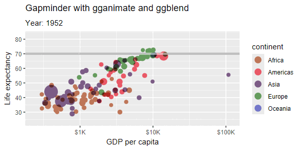
I recently used both these packages to recreate a Gapminder-style animated visualization showing GDP per capita vs. life expectancy across continents over time. This visualization not only demonstrated the expressiveness of the ggplot2 framework but also highlighted how far the tools have come in terms of sophistication and aesthetics. The animation was smooth, the layering was elegant, and the end result was a compelling, data-rich story (you can find the code here).
Why ggplot2 Still Matters
Despite the advent of new visualization libraries in R and other languages (e.g., Plotly, Altair, Vega-Lite), ggplot2 remains highly relevant. Its advantages include:
- Consistency and Reproducibility: ggplot2 code is declarative and highly readable, making it easy to reproduce and share.
- Extensibility: The ecosystem continues to grow with new packages and themes.
- Integration with the Tidyverse: As a core part of the Tidyverse, it integrates seamlessly with
dplyr,tidyr, and other packages. - Community and Documentation: The package is backed by an active community and excellent documentation.
These strengths make ggplot2 not just a visualization library, but a key part of the R data science toolkit.
A Tribute to Hadley Wickham and the R Community
None of this would have been possible without the vision and dedication of Hadley Wickham, the creator of ggplot2. His contributions to the R community extend far beyond this single package, but ggplot2 is arguably his most iconic work. The clarity and power of his design have influenced countless data scientists and analysts around the world.
Conclusion As ggplot2 turns 18, it remains as relevant and powerful as ever. From static plots to interactive animations, from quick exploratory visuals to polished reports, it continues to serve as a foundation for data storytelling. I am grateful to have discovered it early in my career, and I look forward to seeing how it evolves in the years to come.