

Most of the time, that’s a good thing: new visuals, performance improvements, better accessibility, richer formatting options. But occasionally, an update reminds us that “General Availability” does not always mean “zero impact.”
The latest Power BI release involving the new Card visual is a perfect example.
The Situation: A Working Report, Until It Wasn’t
I recently opened a Power BI report that had been stable for months. The report already used the new Card visual. Layouts were carefully aligned, KPI cards were consistent across pages. Everything looked exactly as expected
Then the latest Power BI update arrived.
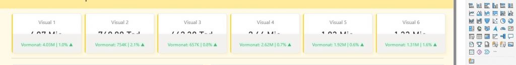
Immediately, something felt off. The layout of multiple KPI cards was distorted:
- Padding and spacing behaved differently
- Text alignment shifted
- Visual proportions no longer matched the original design
At the same time, Microsoft removed the classic Card visual from the Power BI Service.
So even though the visual was already “new,” the update introduced breaking layout changes after General Availability — with no fallback option.
What Actually Changed?
From a technical perspective, this update highlights an important reality:
1. Visual Rendering ≠ Just Styling
The new Card visual is not a simple facelift of the classic one. It is:
- A completely rewritten visual
- Based on a new layout engine
- With different default behaviors for padding, spacing, and responsiveness
Even small internal changes (for example, how text containers resize or how auto-layout reacts to viewport changes) can:
- Break pixel-perfect KPI grids
- Affect dashboards designed for executive or wall-screen use
- Require manual rework across multiple pages
2. GA Does Not Mean “Frozen”
“General Availability” is often interpreted as:
“This visual is now stable and safe to use in production.”
In practice, GA means:
- The visual is officially supported
- It will continue to evolve
- Internal behavior may still change, especially early in its lifecycle
For visuals used dozens or hundreds of times across reports, even small changes can have a large cumulative impact.
3. Removal of the Classic Card Visual Changed the Risk Profile
The real issue wasn’t just that the new Card visual changed.
It was the timing.
- Layout-breaking changes occurred
- The old Card visual was no longer available in Service
- No transition period was provided
That combination removes an important safety net:
- You can’t temporarily revert
- You must fix layouts immediately
- Production reports are affected whether you planned for it or not
Why This Matters in Real Projects
In real-world BI projects:
- KPI cards are everywhere
- They sit on executive dashboards
- They are often tightly aligned with other visuals
- Small visual shifts are highly visible to stakeholders
This kind of update:
- Consumes unplanned development time
- Forces revalidation of dashboards
- Can impact user trust (“Why does this look different now?”)
None of this means the new Card visual is bad — quite the opposite.
The New Card Visual Is Actually Very Good
To be clear:
I genuinely like the new Card visual.
It offers:
- Better formatting flexibility
- Improved consistency across themes
- A modern foundation for future enhancements
- Alignment with Microsoft’s broader visual strategy
This is clearly the right long-term direction.
The challenge is change management, not the visual itself.
What Could Have Helped
A few small things would have significantly reduced the impact:
- A short transition period where both visuals remain available
- A clear release note warning about layout behavior changes
- Explicit guidance on what changed in the rendering engine
- A reminder to validate KPI-heavy dashboards after the update
For teams managing large Power BI estates, these signals matter.
Practical Advice for Power BI Developers
If you rely heavily on the new Card visual:
- Re-open and validate all production reports
- Especially KPI grids and summary pages
- Check alignment across different screen sizes
- Desktop vs. Service rendering can differ
- Avoid overly tight spacing
- Leave some visual “breathing room” where possible
- Expect evolution
- Early GA visuals may still change internally
Final Thoughts
Power BI continues to improve — and that’s something I fully support.
But this update is a reminder that:
Even small visual changes can have large downstream effects.
As developers, we adapt.
As platform providers, clear communication makes all the difference.
And yes — Power BI definitely knows how to keep us busy. 😊