
These interesting 3D visualizations not only highlight the differences in population density between countries but also bring to life the unique geographical and social characteristics that contribute to these numbers.
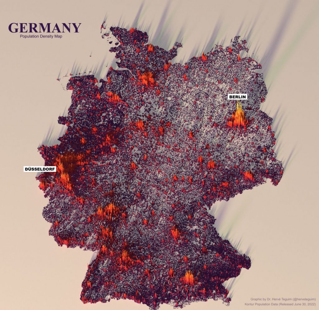
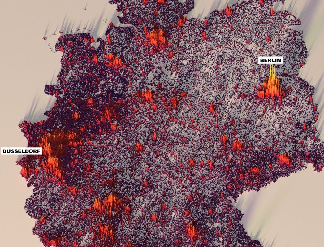
Germany, with its 83 million inhabitants and an area of 357,600 km², has a very high population density of 233 inhabitants/km². This is a testament to its well-developed urban areas and efficient use of space. In contrast, when we look at some African countries, we see a different story unfold.
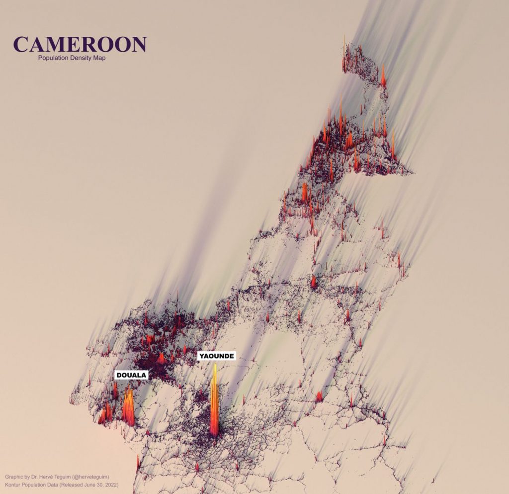
Cameroon: With a population of approximately 27 million and an area of 475,442 km², it has a population density of about 60 inhabitants/km². Cameroon’s diverse landscapes, ranging from coastal beaches to dense rainforests, contribute to its lower density.
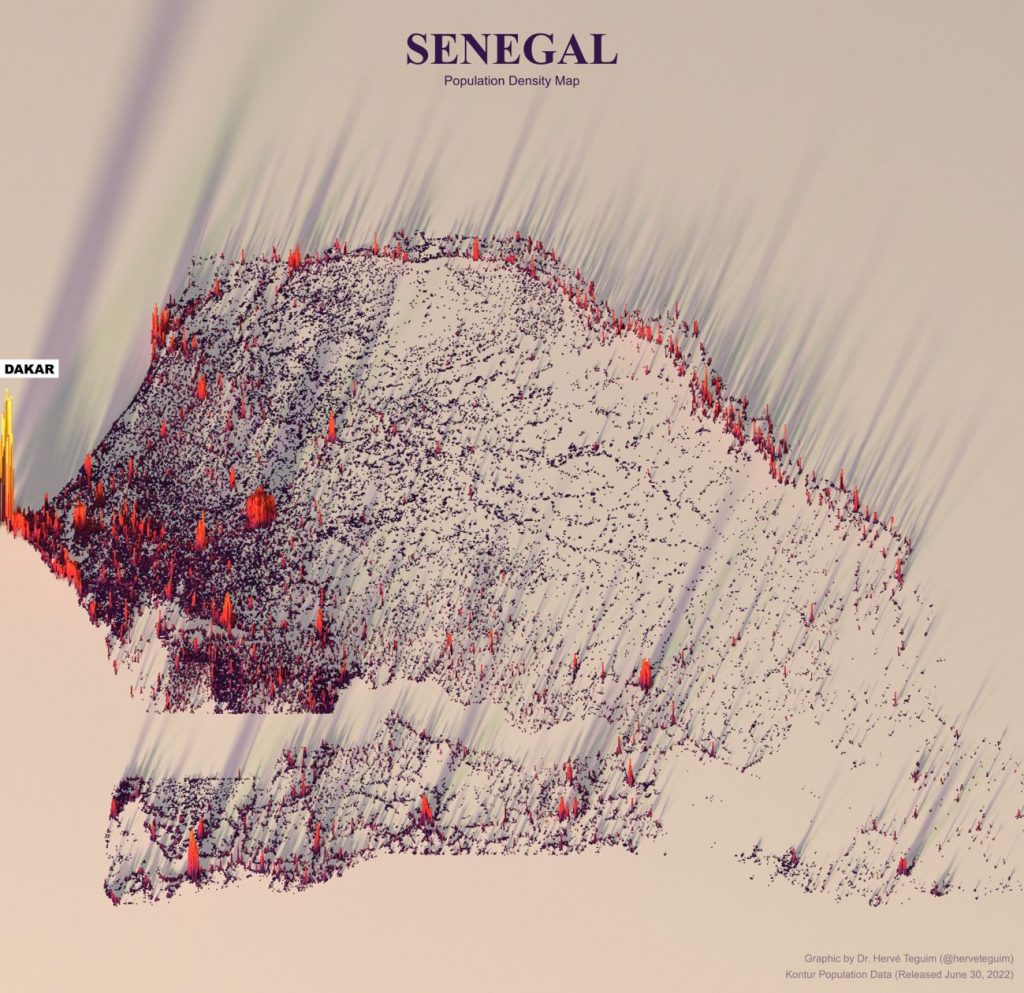
Senegal’s population of around 17 million and land area of 196,722 km² result in a density of 90 inhabitants/km². Its economy is anchored by agriculture, which requires vast, open spaces for cultivation, thus affecting its population distribution.
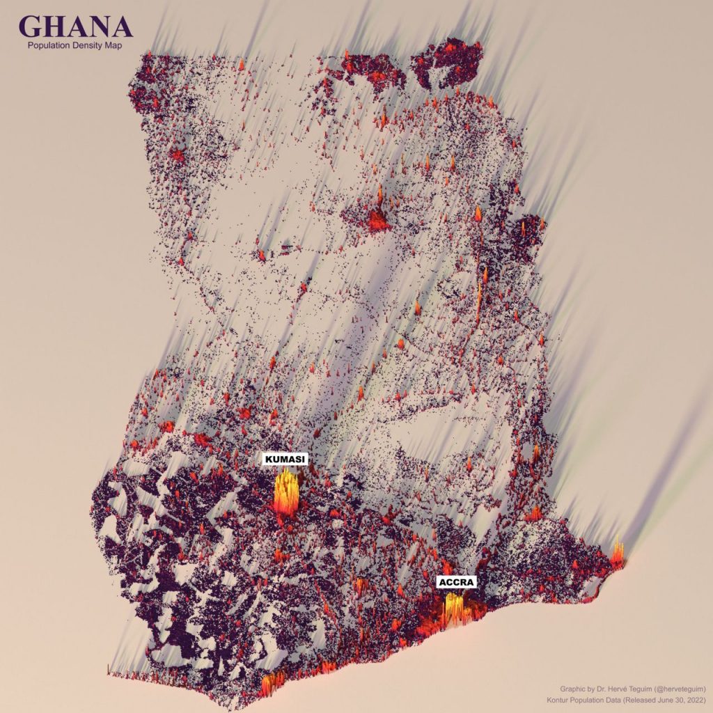
Ghana stands out with a higher density of 156 inhabitants/km², with a population of about 31 million and an area of 238,533 km². Ghana’s growing economy and urbanization, especially in cities like Accra, drive its higher density figures.
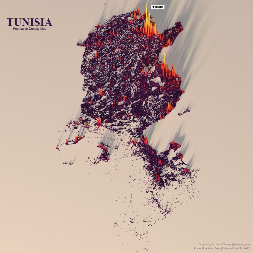
When we add Tunisia into the mix, with a population of around 12 million and an area of 163,610 km², we get a density of approximately 73 inhabitants/km². Tunisia’s population is concentrated along the Mediterranean coast, leaving the Sahara region sparsely populated.
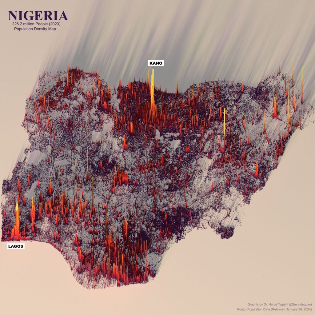
Nigeria presents another interesting case in terms of population density. With a population of approximately 229 million as of 2024 and a total land area of 910,770 km², Nigeria has a population density of about 248 inhabitants per km². The high density is indicative of Nigeria’s status as one of the most populous countries in the world, ranking number 6 globally.
These 3D visualizations not only show numbers but also tell stories of human settlement, economic development, and natural resource distribution. They allow us to see how countries manage their space and resources, and how this management affects the lives of their inhabitants.
By comparing these figures, we gain insights into the challenges and opportunities faced by different nations in terms of urban planning, sustainability, and growth. It’s a powerful reminder of how diverse our world is and how data visualization can help us understand and appreciate this diversity in a more tangible way.
Source of the data https://data.humdata.org/dataset/kontur-population-dataset