
In recent weeks, I’ve come across multiple discussions around Power BI custom visuals. The ecosystem is undeniably large—AppSource currently offers hundreds of visuals (reportedly over 900), covering everything from advanced KPI cards to sophisticated storytelling components.
At first glance, this seems like a clear advantage: more visuals should mean more flexibility and better insights. But when moving from experimentation to enterprise deployment, the picture changes significantly.
Evaluating Custom Visuals in Practice
I tested a range of KPI-focused custom visuals from AppSource. From a purely functional and design perspective, many of them offer strong capabilities:
- Advanced formatting and interactivity beyond native visuals
- Built-in storytelling features (annotations, conditional formatting, variance indicators)
- Faster prototyping of dashboards
These benefits make them attractive, particularly for demos or proof-of-concept work.
However, these advantages often don’t translate well into enterprise environments.
Enterprise Constraints: Governance and Compliance
In production-grade BI systems, technical decisions are rarely driven by visual appeal alone. Instead, governance, security, and maintainability take priority.
In most enterprise Power BI environments, custom visuals face several constraints:
1. Governance Restrictions
- Only certified or explicitly approved visuals are allowed
- Many AppSource visuals are blocked by default
- Approval processes can be slow and restrictive
2. Security and Compliance Concerns
- Custom visuals may introduce external dependencies
- Some visuals require additional permissions or data access scopes
- Organizations often avoid unmanaged code execution within reports
3. Deployment Limitations
- Importing
.pbivizfiles is frequently disabled - Locally developed visuals are typically not permitted
- Versioning and lifecycle management of custom visuals is complex
Real-World Impact
In one of my recent projects, these constraints resulted in a very limited set of usable visuals:
- Only two KPI custom visuals were approved for production use
- All others—despite being technically suitable—were not deployable
This significantly reduced the practical value of the broader custom visuals ecosystem.
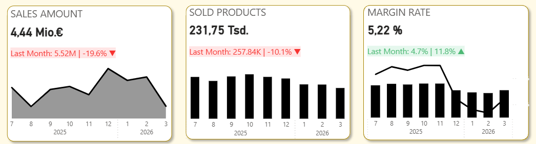
Alternative Approach: Native Visual Composition
Given these limitations, I explored an alternative approach: building KPI reporting solutions using only native Power BI visuals.
Design Strategy
Instead of relying on a single custom visual, I composed a KPI view using:
- KPI Card (new native visual) for current value and status
- Line chart / trend visual for historical context
- Supporting elements such as:
- Conditional formatting
- Measures for variance and trend calculation
- Tooltips for additional context
Technical Benefits
This approach provided several advantages:
- Full governance compliance
No dependency on external or uncertified components - Improved maintainability
Native visuals are fully supported and version-stable - Flexibility through DAX
Custom logic (e.g., trends, thresholds, indicators) can be implemented in measures rather than visuals - Simplified deployment
No additional approval or packaging required
Architectural Perspective
From a BI architecture standpoint, this raises an important consideration:
Should visualization complexity be handled in the visual layer, or in the semantic model?
Custom visuals tend to push logic into the presentation layer. In contrast, a native approach encourages:
- Centralized logic in the data model (via DAX)
- Reusable and testable measures
- Clear separation between data, logic, and visualization
This aligns better with enterprise BI best practices.
Key Takeaway
Custom visuals are valuable tools and can significantly enhance reporting—especially in exploratory or less restricted environments.
However, in enterprise BI contexts:
- Governance constraints often outweigh visual flexibility
- Native visuals provide greater reliability and control
- Well-designed data models can compensate for visual limitations
In many cases, combining standard visuals in a structured way delivers a solution that is not only compliant, but also robust and maintainable.