When working on modern data platforms, productivity is often discussed in terms of performance, scalability, or feature depth. While these aspects are critical, there is another factor that quietly but significantly shapes daily efficiency: user experience (UX).
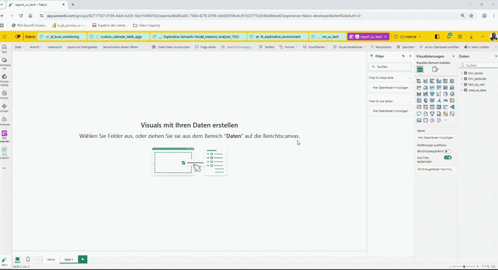
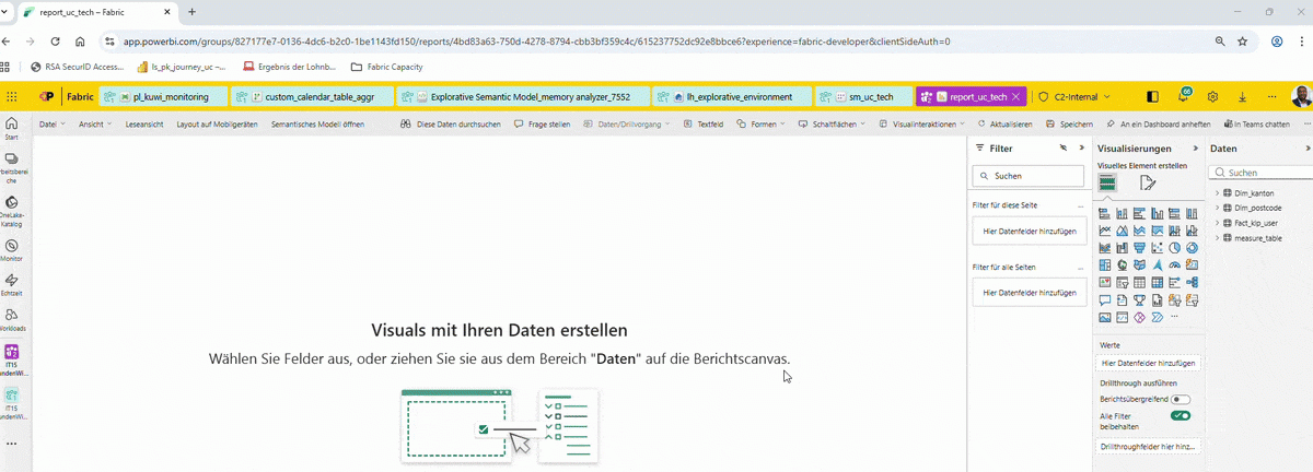
Recently, while working with Microsoft Fabric, I noticed a seemingly minor feature that had an outsized impact on how smoothly I work: the ability to navigate across multiple Fabric artifacts within a single browser tab.
In Fabric, I can move seamlessly between:
- Data Pipelines
- Dataflows
- Notebooks
- Lakehouses
- Semantic Models
- Power BI Reports
All without spawning a new browser tab for each artifact.
At first glance, this may look like a simple navigation choice. In practice, it meaningfully changes how data work feels and flows.

Why Single-Tab Navigation Matters in Data Engineering
Data engineering and analytics work is inherently context-heavy. Building a solution typically involves constant transitions:
- from ingestion logic (pipelines),
- to transformation layers (dataflows or notebooks),
- to storage (lakehouses),
- to semantic modeling,
- and finally to reporting and validation.
In many tools, each step opens a new tab. Over time, this leads to:
- browser tab overload,
- cognitive fatigue,
- slower context switching,
- and a fragmented mental model of the solution.
By keeping navigation inside one tab, Microsoft Fabric reduces this friction. The result is not just a cleaner browser, but a more coherent working experience.
Practical Benefits Observed
From a technical workflow perspective, this design choice brings several advantages:
1. Reduced cognitive load
Engineers can focus on the logic and data relationships instead of managing tabs and windows.
2. Faster context switching
Moving from a pipeline to its downstream model or report is immediate and intuitive.
3. Improved mental flow
Staying in a single workspace helps maintain continuity when debugging, validating, or iterating.
4. Cleaner workspace, fewer errors
Less visual clutter means fewer chances of editing the wrong artifact or losing track of changes.
These benefits compound over time—especially when working long hours on complex data solutions.
UX as an Engineering Enabler
Good UX is often seen as a “nice-to-have” layer on top of technical capability. In reality, UX decisions directly influence:
- development speed,
- solution quality,
- and engineer satisfaction.
Microsoft Fabric’s single-tab navigation is a strong example of UX serving engineering productivity, not distracting from it. It shows an understanding that real-world data work is iterative, interconnected, and mentally demanding.
Final Thoughts
Small, thoughtful UX decisions—like how navigation is handled—can have a measurable impact on how effectively engineers build, debug, and deliver data solutions.
Productivity in data platforms is not always about adding more features. Sometimes, it is about removing friction from the workflow.
Kudos to the Microsoft Fabric team for recognizing that good engineering tools are not only powerful, but also calm, focused, and respectful of the user’s attention.

