
In analytics engineering, few assets are as critical—and as underestimated—as the semantic model.
Whether you’re working in Power BI, Tableau, or a modern data stack with tools like dbt + semantic layers, the data model is the foundation that determines how efficiently users can explore, trust, and extend data.
A well-designed model should not require explanation. Its structure should communicate itself.
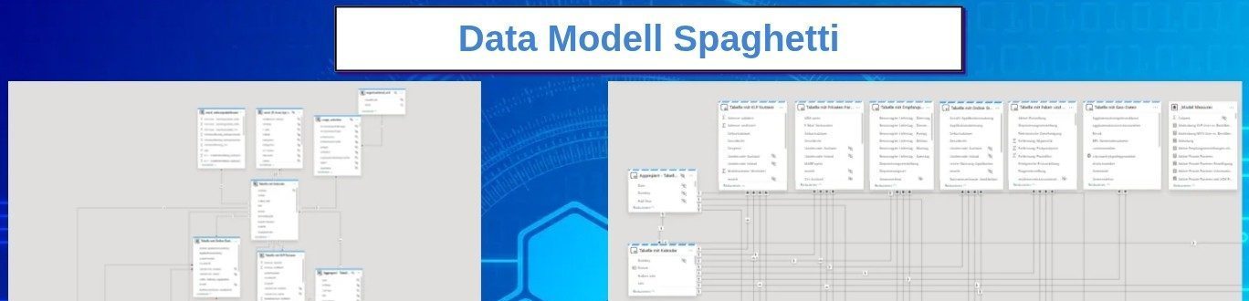
And surprisingly, what many would call a “spaghetti” layout can actually be a powerful tool to achieve that clarity.
The Problem: Models That Grow Without Design
In theory, data models are designed deliberately.
In reality, they evolve.
New tables are introduced under delivery pressure. Business requirements shift. Additional metrics require new joins, new grains, new transformations. Over time, what started as a clean star schema becomes a layered, tangled structure.
Typical symptoms emerge:
- Relationships crossing arbitrarily across the canvas
- Mixed granularity between fact tables
- Implicit many-to-many joins creeping in
- Circular or ambiguous filter paths
- Hidden dependencies between measures
At that point, the issue is no longer just aesthetic—it becomes structural.
Understanding the model slows down. Debugging becomes non-trivial. Trust erodes.
The Misconception: “Clean Layout = Clean Model”
Many teams attempt to “clean” the model visually by aligning tables neatly or minimizing crossing lines.
This often leads to a false sense of clarity.
A visually tidy layout can still hide:
- Inconsistent grain definitions
- Improper relationship directions
- Over-normalized dimensions
- Redundant or unnecessary tables
Clarity does not come from symmetry—it comes from semantic alignment.
A More Effective Approach: Structured “Spaghetti”
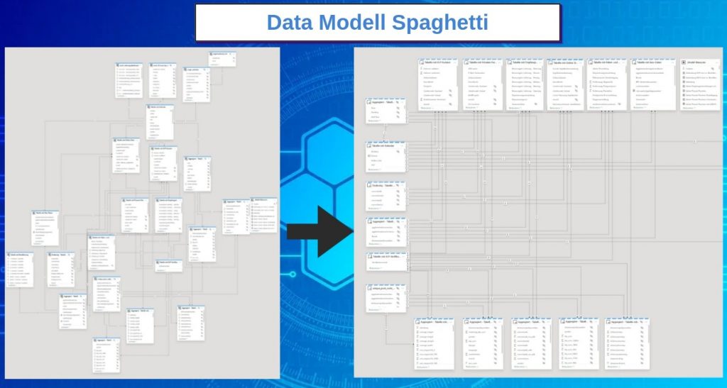
What I advocate for is not chaos, but intentional structure that reflects data flow—even if that results in crossing relationships.
A practical layout pattern:
- Dimension tables on the left
- Core fact tables at the top
- Aggregated or derived tables at the bottom
This creates a directional reading of the model:
Dimensions → Facts → Aggregations
From a cognitive standpoint, this mirrors how queries are executed:
- Filters originate from dimensions
- They propagate into fact tables
- Aggregations are computed on top
Even if relationships visually cross, the logic becomes immediately interpretable.
Why This Works (Technically)
1. It Aligns with Filter Propagation
In most BI engines, filter context flows from dimension tables to fact tables via one-to-many relationships.
By placing dimensions consistently on one side, you make filter direction explicit.
This helps developers quickly answer critical questions:
- Where does this filter originate?
- How does it propagate?
- Which tables are affected?
2. It Surfaces Granularity Issues
When fact tables are grouped together at the same level, inconsistencies in grain become obvious.
For example:
- A daily sales table next to a monthly budget table
- A transaction-level table next to a snapshot table
This visual proximity forces the right questions:
- Should these be conformed?
- Do we need bridge tables?
- Are we introducing ambiguity in measures?
3. It Highlights Relationship Complexity
Crossing lines are not inherently bad.
They are signals.
They often indicate:
- Many-to-many relationships
- Role-playing dimensions
- Degenerate dimensions embedded in fact tables
Instead of hiding complexity, a “spaghetti” layout exposes it—making it easier to evaluate whether it’s justified or should be simplified.
4. It Reinforces Star Schema Thinking
Even in complex models, the goal remains:
- Clear separation between facts and dimensions
- Minimal and controlled relationships
- Avoidance of snowflaking unless necessary
By structuring the layout around these principles, you visually enforce:
- One-to-many relationships from dimensions
- Centralized fact tables
- Limited join paths
Going Further: Best Practices for Maintainable Models
A strong layout only works when supported by solid modeling discipline.
Key principles:
Consistent Granularity
Every fact table must have a clearly defined grain.
Avoid mixing grains within the same table or across loosely related tables without explicit handling.
Relationship Discipline
- Prefer single-direction filters unless there is a clear justification
- Avoid bidirectional relationships as a default solution
- Eliminate unnecessary joins
Table Minimization
Each table should have a purpose.
Remove:
- Intermediate staging tables exposed to the semantic layer
- Redundant aggregates that can be computed dynamically
- Duplicated dimensions
Naming and Semantics
Clarity is not just visual.
- Use explicit, business-friendly naming
- Distinguish clearly between facts, dimensions, and helper tables
- Make measures self-explanatory
The Real Impact
When structure and layout align, the benefits are immediate:
- Faster onboarding of new developers
- Reduced time to debug complex measures
- Lower risk of incorrect aggregations
- Increased trust in reported metrics
And perhaps most importantly:
The model becomes navigable.
Opening it no longer feels like deciphering a system—it feels like reading one.
Final Thought
A data model is not just a backend artifact—it is a communication tool.
If someone cannot understand it within seconds, the design has failed, regardless of how “clean” it looks.
So don’t aim for visual perfection.
Aim for structural clarity.